Antena 3 is a Spanish television network owned by Atresmedia. Launched in 1989, it has grown to become one of Spain’s most-watched channels, offering a wide variety of programming, including news, entertainment, and drama series.
History of Logo Creation
The Antena 3 logo has undergone multiple redesigns since the channel’s inception. The network aimed to create a visual identity that reflected its innovative and dynamic approach to broadcasting. The first logo, introduced in 1989, featured a simple yet bold design. Over the years, it has been modernized to align with contemporary design trends and branding strategies.
Design and Logo Elements
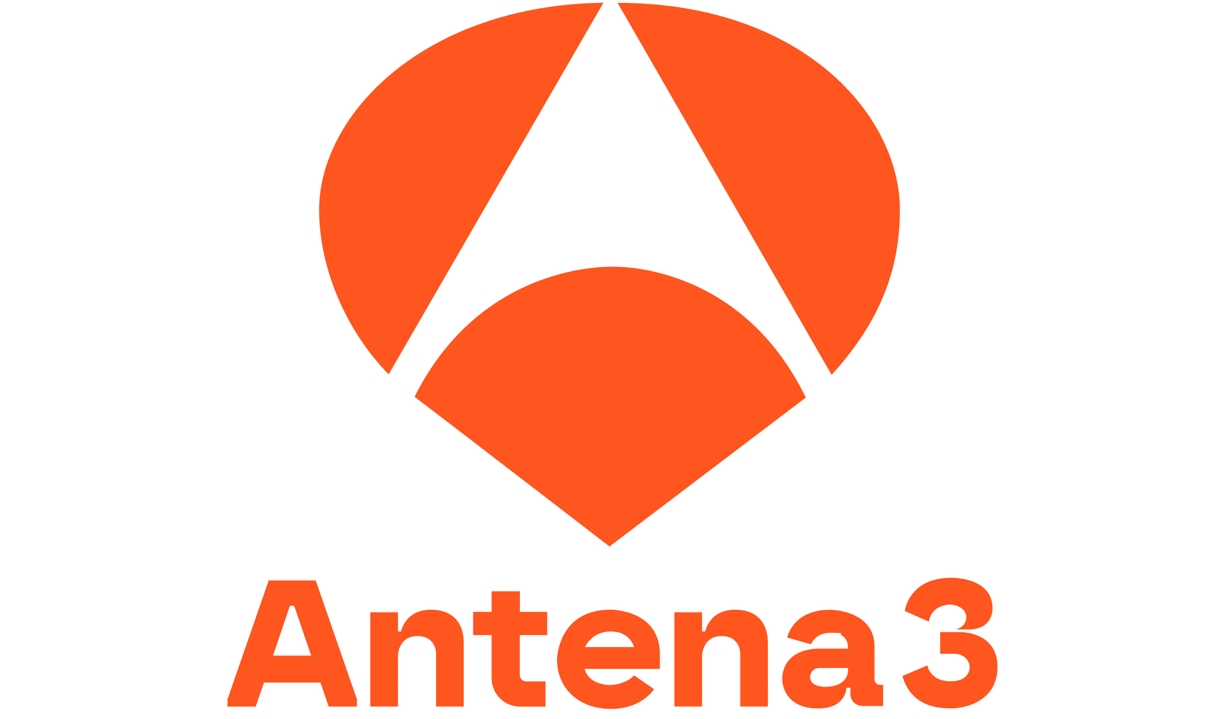
The Antena 3 logo features a distinctive, circular shape with an abstract design. The choice of geometric elements and smooth curves represents fluidity and adaptability. It also conveys a sense of movement, which aligns with the network’s commitment to delivering dynamic content.
Logo Evolution
- 1989-1992: The first logo featured a bold, colorful design with a stylized ‘A’.
- 1992-1997: A sleeker, more modern design was introduced, simplifying the original elements.
- 1997-2004: The logo adopted a more refined look with smoother lines and an abstract shape.
- 2004-Present: The current logo features a minimalist, three-part shape, symbolizing connection, communication, and innovation.
Color
The dominant colors of the Antena 3 logo have varied over time, but orange remains a significant element. The warm tone symbolizes energy, enthusiasm, and creativity, which align with the network’s branding goals.
Font
The typography used in the Antena 3 logo is modern and clean, ensuring readability across different media platforms. The choice of font reflects professionalism while maintaining a friendly appeal.
Symbol
The logo’s abstract three-part design represents the three pillars of Antena 3: entertainment, information, and innovation. The curves and rounded edges add a sense of approachability and flexibility.
Stories
- Inspired by a Satellite Dish: One of the early logo concepts was inspired by the shape of a satellite dish, reflecting the network’s role in broadcasting.
- Audience Feedback Influence: In one of the redesigns, Antena 3 conducted a public survey to gauge viewer preferences, resulting in tweaks to the final design.
- Hidden Meaning in the Shape: Some interpretations suggest that the logo’s three segments symbolize the synergy between the channel, its content, and its audience.
The Antena 3 logo continues to evolve while maintaining its core identity, making it a recognizable symbol in Spanish television.


